Press Start to Begin...
I have tried the blog thing before, a long time ago when I was in college. I tried doing a daily art thing, which was a trend that was going around at the time, and I failed. I do draw every day, but they are not all finished pieces or even things I would want to share with everyone. As an art student, I was under the false thinking that the only Art people want to see were finished art and good art. No one wants to see your failures. But now I know that is not true at all. Failure is an important step that and facing it and excepting failure helps young artists grow confident. We all have our failures. It is a step we all need to remember that it happens and we learn from them every time. So if I did have an art blog today, I would approach it differently.
This is and is not an Art Blog. This blog is more focused than my previous one. This blog will cover my thoughts, experiences, and artwork for tabletop role-playing games. I have been playing RPGs since 1996 and have been inspired by them ever since. I have made tons of artwork of my characters, and of other people's characters; dipping into the worlds and actions of those experiences. I have also been experimenting with game mechanics for nearly as long and I remember the first time I saw a D&D player's handbook, and this was before I started to play, I thought to myself, "I could make something like this". Roleplaying games are just inspiring no matter the genre or game system.
Most of the artwork I will be posting will be from the weekly Monster drawings that I do. Most of the time I live stream my drawing session over on twitch. It's fun to chat with people as I draw something random and just chill. I don't have a set schedule for when I get on to twitch, but I do post up on twitter beforehand. That way, if anyone is on and interested they can come to hang out.
The other stuff I will be posting about is stuff I create to be used in roleplaying games. That's what this post is about. Today I want to talk about the book I am working on based on some of the Monsters I drew over the last two years. I made a book last year, called Here Be Monsters, which you can find up online to buy. This year's book is similar to the Here Be Monsters, except instead of a book made for Gamemasters, this one is for players.
Dungeon Pets is a book of Monsters, creatures, that the players can buy/find and train. The book will have my simple rules for training the pets and what they can be trained to do. Each page of the book will be a pet, each with their own abilities, armor rating, habits, etc. Lots of useful information for both Gms and Players alike. Right now, I am finalizing the writing while I work on the layout for the book.
The Layout for the previous book was done as landscape. I did this because when I draw all of these creatures, I draw them in a landscape format on the computer. As a professional animator, this format is just kind of natural for me at this point. But this time I am going for a Zine sized layout. Which brought me to the first stumbling block. How do you show everything I drew for these while keeping every creature to a single page.
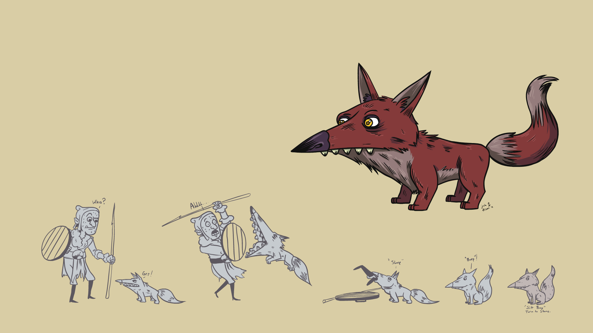
Like above, you can see I drew some actions to show what this little guy can do. I hope I can have enough space left over to add this drawing at the bottom or maybe even at the beginning of the book where all the rules and such will be housed.
Anyway, here is the layout I am currently playing with. I like the last two the best but still think I'm, not sure if they will be the right way to go.
As you can see, I tried to do a two-page setup, which is similar to what I did with Here Be Monsters Vol 1. But with the following two, I moved away from that because I rather keep everything to one page this time around. You can easily print or copy one page of the book and hand it to a player if they got one of these pets. On the second page's layout, you can see me experimenting with whether or not I want to use more graphic symbols to express different ideas. I think this works for the Pet's health but not so much for the Gold Coin for cost. I think I rather have the cost written out instead. the other thing I am working out is if I want to stick to the 5.5 x 8.5 Zibe size for the book. I think if I move it up to 6x9, I can get more on the single page that I could be for. Because one of the things I have to keep in mind is how much space the Description of the Pet takes up. Currently, with the last two layouts, if the description text is more than what it is here, then I will easily run out of room for everything.
I'm not a graphic designer, but I do know a few things about layout from when I went to college. While I am doing all of this I am also thinking about legibility and the use of negative space. I want the book to be easy to read while also easy on the eyes. To much white space and too little can strain the eyes. I think this is one of the issues that people have with reading whole gamebooks. the books are designed around the idea of getting as much content on a page than making it easy and enjoyable to read. But that is a different post for another day.
So that is where I am at the moment. I'll post more as I get further along into this process.


No comments:
Post a Comment